Commercial and Office Spaces
1970s Commercial Interiors
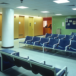
The interior design trends of the 1970s were a study in polarity. A strong visual shift mid-decade separated one extreme design trend from another. In the first half of the decade, one finds a visual austerity and in the second half, decadence. Brilliant colors became murky earth tones; aloof high-tech futurism gave way to nature-loving environmental bohemianism.
The “Mod” looks of the first half of the 1970s were strongly influenced by the previous decade, Modernism, and the continuing exploration of cutting edge technologies. These advancements allowed for the possibility and accessibility of new materials that made for an exciting juxtaposition of form and function. Designers fearlessly used vivid greens, brilliant blues, sunshine yellows, glowing oranges, and bright pinks — as well as an abundance of white to offset the bright color interiors — to create a playful aesthetic. While design was strong and severe in form, influences ranged from Scandinavian and Bauhaus to organically shaped plastics, vinyl, and fabric-created shapes. Commercial interiors were no exception. Hospitals, corporate offices, and schools all explored this use of bold unapologetic color while playing with contradictory geometry, hidden corners, and curvaceous structures to define their spaces.
Bill Maris elevated the art of commercial interior photography to new heights by turning his lens toward these ultramodern commercial interiors as created by the leading architects of the day. By manipulating the relative position of architectural structures and the properties of space using both natural and artificial light, Maris and his partner Julie Semel were able to strike a balance between public spaces that reflected growing cultural isolation and the expanding attitude of narcissism of the “Me generation” of the 1970s.
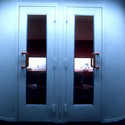
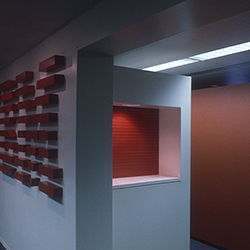
A Phone Booth, IBM Office
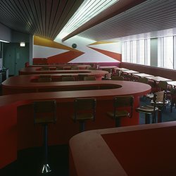
Cafeteria, Lutheran Hospital
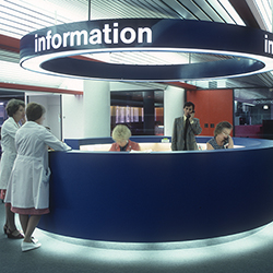
Reception, Lutheran Hospital
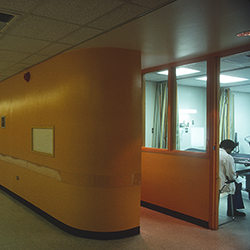
Hospital Corridor, Jersey City Hospital
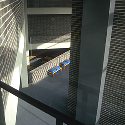
State University of New York at Purchase
|
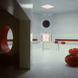
Swimming Pool, New York State School
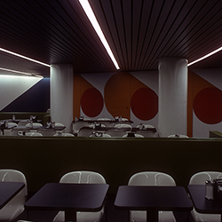
Cafeteria, Lutheran Hospital
Waiting Room, Lutheran Hospital
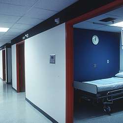
Hospital Corridor, Lutheran Hospital
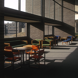
State University of New York at Purchase
|
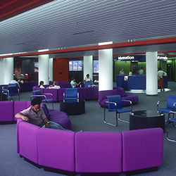
IBM Offices
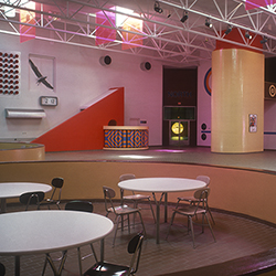
Cafeteria, New York State School
Waiting Room, Jersey City Hospital
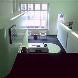
Gwathmey Siegel & Associates Offices
|
